Making color-correct artwork files for apparel labels is a precise art. A secret art, some might say. But we love to share what we know and are more than happy to reveal the secrets behind design for textiles. Here's how we create color-correct artwork files in-house and how you can use this info to look like a rockstar.
Why every apparel brand should know about color matching
Different color libraries
The first is that colors don’t translate accurately across all mediums, so you need to design your file according to the format of your label (woven, coated paper, uncoated paper, etc.). To avoid a color-matching catastrophe, start your design using the correct Pantone library: Pantone TCX for woven labels, Pantone U for uncoated paper, and Pantone C for coated papers.
It's easier to start out in the correct library because they don't all share the same colors; when they do, the tones appear brighter or more muted. You’ll fall in love with a design, only to realize the colors you love can’t be accurately recreated in the final product. This is also true for standard effects like tints. Effects like this cause challenges with specific products or production routes when you recreate them as labels.
Infallible color recreation
The second reason is that colors are treacherous. Your RGB screen, lighting conditions, human eyeballs, and the material you're printing on will all change how the color appears.
Working with professionals like our (frankly, magical) design team here at Checkpoint will ensure a reliable, accurate color standard for each label format you use — no back and forth with samples at the printer and no second-guessing. Just pure peace of mind.
Consistent visual branding
The final reason is that color consistency is an absolute must for branding. Imagine your garments hanging in a beautiful, compliant display, marred by a range of labels that are all slightly off from your true brand colors. It doesn't just look sloppy; it also hurts the integrity of your visual brand and could make some of your products look like knockoffs. Not cute.
Long story short, when you know how to make artwork files that suit the concept and the label format, you can fly through labeling projects. You’ll also be armed with helpful digital design smarts that you can fall back on when the situation demands it (because who doesn’t want to look super well-informed in the concept meeting?). We've got the knowledge and are happy to share, so let's go!
The secrets behind making color-correct artwork files for different label formats
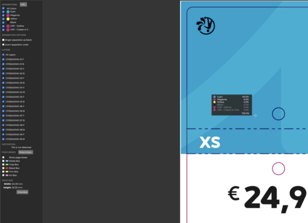
Run a color report
One of the first things we do when a brand concept hits our desk is create a color standard that suits your chosen label type and production route. We know how color reproduces across everything we make and how it reproduces on different fabrics and with different machines.
We take your artwork file or physical sample and run it through our custom-built software to find the closest possible match. We can create the digital standard from whatever you give us! Your color report will look like this…
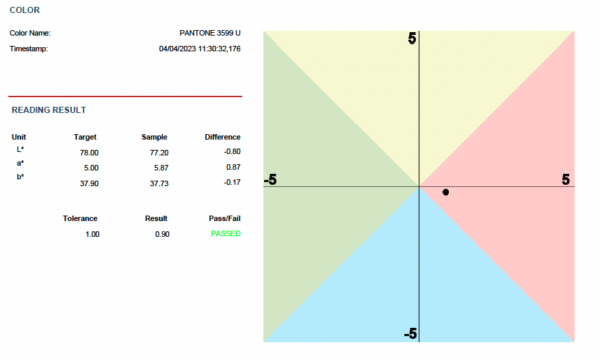
Set the standard
The absolute correct color sits right in the middle. The distance between the circle's center and the L*a*b* value of the printed color (aka the color in its most accurate printed form) is the 'Delta E value.'
We can set your Delta E value to the level of accuracy you want, with 0 being the most accurate. For example, if you’d like your labels to be incredibly precise, we can set your Delta E value on print right down to 1 (we can’t set it to 0), even though the human eye can’t see differences at that 1 or below. For standard color matches, we use a value of 2.
Everything is standardized and measured under certain conditions, including the lightbulbs in our studio — we use 5000-degree Kelvin LEDs which is the cleanest and most consistent we’ve found, just to ensure the colors look true when we’re assessing them.
Our custom-built color-matching software is so smart that it can even find a solid color alternative for tints (something that’s tough to do). So even if you “accidentally” create a design with a tint in it, our team will be able to help you convert it to its nearest possible match.
Pass the knowledge to you
Once we’ve got your chosen color values for each of the label formats you regularly use, your Checkpoint Systems contact will store it in your account. Our designers will automatically use the correct colors every time to the exact Delta E standard you’ve specified. That means unparalleled color accuracy, no matter which label you’re designing for.
Once you’ve got your brand palette in target colors for your most commonly used base materials and manufacturing methods, you’ll be away! There is no need for delays while we convert the colors for you, just perfect artwork files every time.
Better yet, all this extra intel will make you look even more awesome at what you do. Color consistency is key to brand trust and we can get you there, regardless of the product format, the base material, or the method of manufacture.
By now, you're (hopefully!) ready to tackle your next label project armed with design knowledge from some of the best color matchers in the business. However, if you have questions, we'll be happy to answer them for you. Contact our team and make full use of our decades of experience — we love sharing it!